In today’s competitive market, standing out requires not only a unique product but also a compelling story. Kona Tuna & Sardines, founded by passionate fishermen in 2018, perfectly blends sustainability with innovative design to capture the hearts and loyalty of its consumers. Collaborating with the talented designer Mike Karolos, they have crafted a distinctive brand identity that mirrors their commitment to sustainable fishing practices.
A Sustainable Start
The foundation of Kona Tuna is built on preserving marine life. Their use of the traditional pole and line fishing method ensures minimal impact on the ocean ecosystem. This practice, though not the most cost-effective, avoids the unintended capture of other marine creatures like sharks and dolphins. Within a year of its founding, Kona Tuna became a symbol of responsible fishing in Libya, a region known for its high per capita consumption of canned tuna.

Building the Brand
Kona Tuna approached Mike Karolos to design their logo and packaging, and this collaboration soon evolved into crafting the entire brand identity. The design brief was clear: create a logo that is modern, bold, and instantly recognizable. Mike delivered by integrating elements that reflect both the brand and its ethos – the sea, a stylized letter ‘K’, and a fish head – all encased in a round logomark that mirrors the shape of their cans.
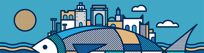

The logotype is complemented by Mike’s signature illustrative style, resulting in packaging that is not just functional but a visual delight. The designs are vibrant and contemporary, standing out on the shelves and capturing the attention of sustainability-conscious consumers.
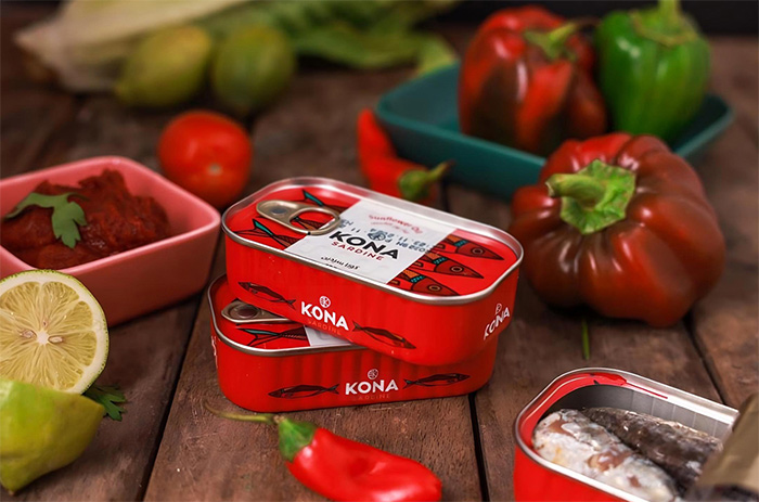
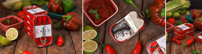
Eye-catching Packaging
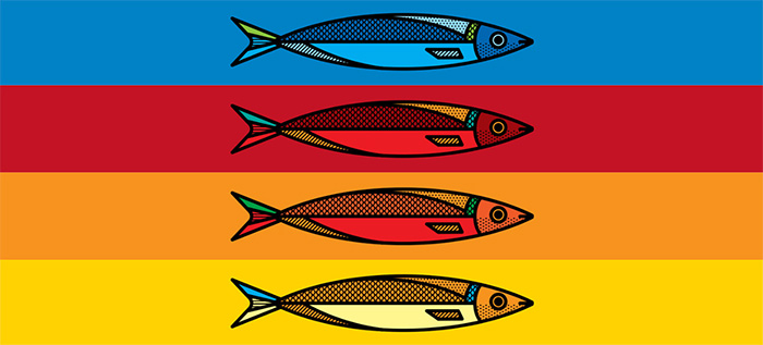
Starting with a limited edition can, Mike expanded the design suite to include Kona’s Yellowfin tuna and sardine packaging. Each package is a testament to the craftsmanship and attention to detail that has become synonymous with Mike Karolos’ work. The use of bold colors and clean lines not only underscores the brand’s commitment to the environment but also its modernity and relevance in today’s market.
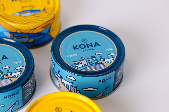
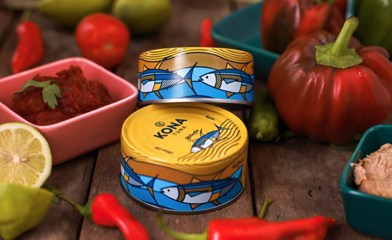
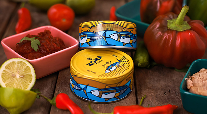
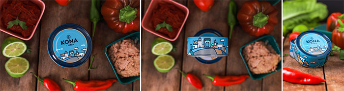
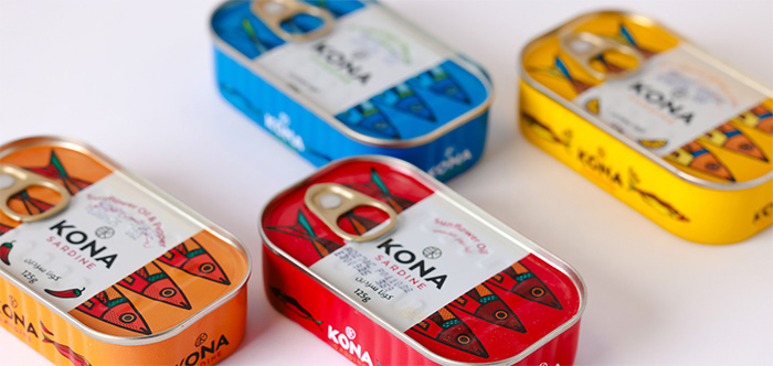
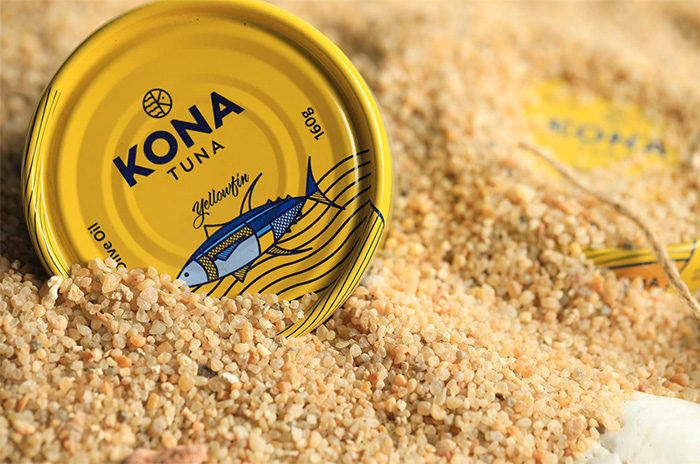
This Kona Tuna packaging features a bright and engaging design, perfect for grabbing attention on the shelf. The can is adorned with a striking combination of yellow and blue, evoking oceanic and natural elements.
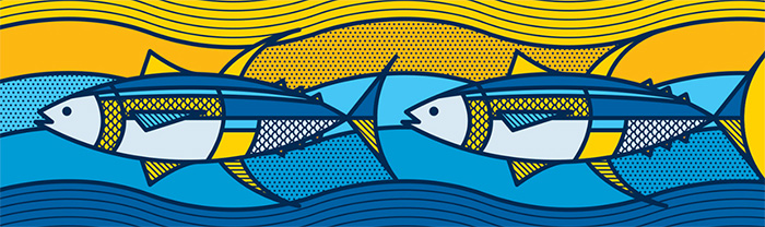
The main visual is an abstract, stylized fish illustration that wraps around the can, incorporating geometric shapes and patterns that give a dynamic, contemporary feel. The wave-like patterns and dots add texture and movement, enhancing the maritime theme.
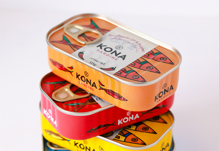
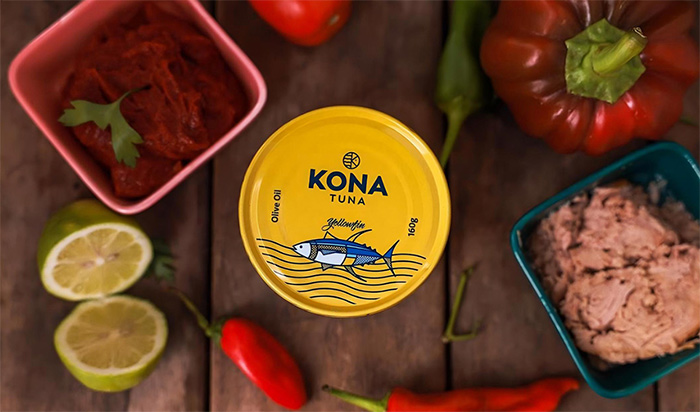
The top of the can displays the Kona Tuna logo in a bold, modern typeface, with a small fish illustration beneath it. This clean and simple typography complements the vivid illustrations, creating a cohesive and eye-catching design that emphasizes the brand’s commitment to sustainability and creativity.
The Road Ahead
Kona Tuna & Sardines plan to continue their journey with ongoing branding projects led by Mike. The company is set to expand its reach while remaining true to its core values of sustainability and quality. As consumers increasingly prioritize environmentally friendly products, Kona Tuna is poised to make a significant impact beyond the Libyan market.
In conclusion, the partnership between Kona Tuna and Mike Karolos exemplifies how thoughtful design can enhance brand values and consumer appeal. As we move into a future where sustainability is not just an option but a necessity, brands like Kona Tuna & Sardines show that businesses can thrive while taking care of the planet.