
A fresh approach to food branding and packaging design
In a highly saturated food market, creating a brand that feels both healthy and visually engaging is a challenge. Glow Bite stands out as a strong example of how branding and packaging design can balance energy with clarity.
Color strategy: vibrant but intentional
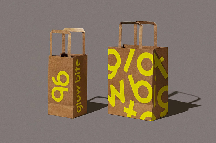
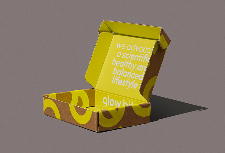
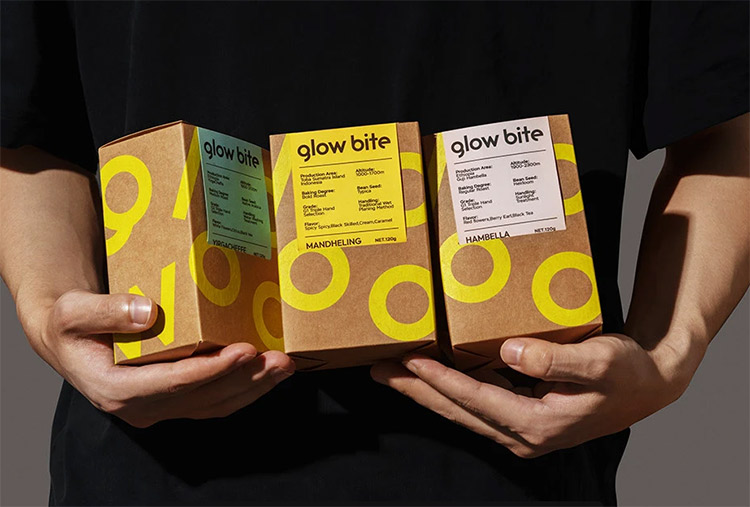
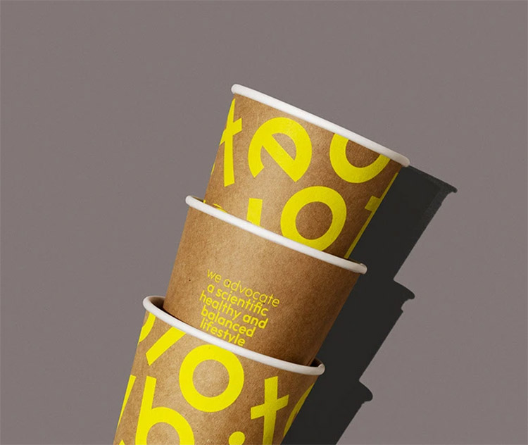
One of the most distinctive aspects of this project is its color palette. The use of bold, vibrant tones immediately captures attention, but it never feels excessive. Each color is applied with purpose, creating a clear visual hierarchy that enhances both brand recognition and shelf impact.
Typography that supports the brand identity
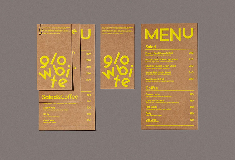
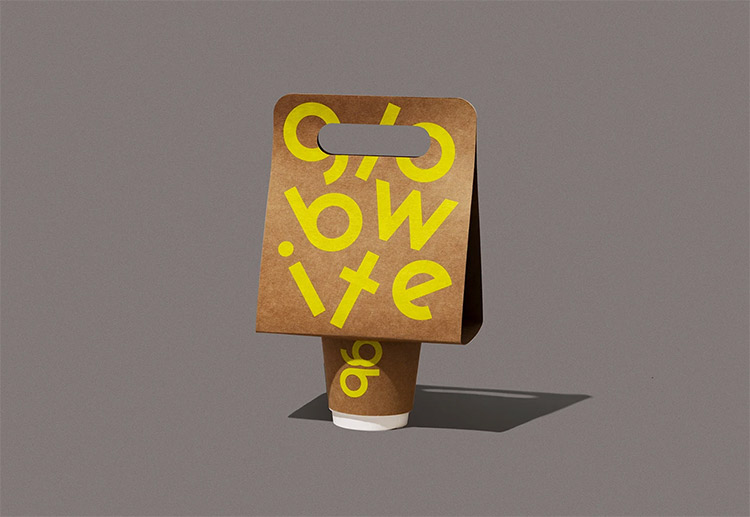
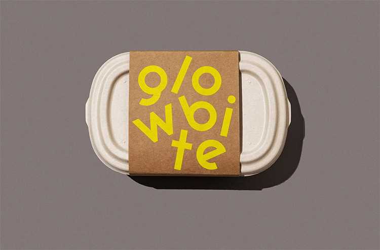
The typography plays a key role in grounding the visual system. The logotype feels modern and slightly playful, while maintaining excellent legibility across different formats. Supporting fonts are minimal and functional, allowing layout and spacing to define the brand’s personality.
Packaging design that works as a system
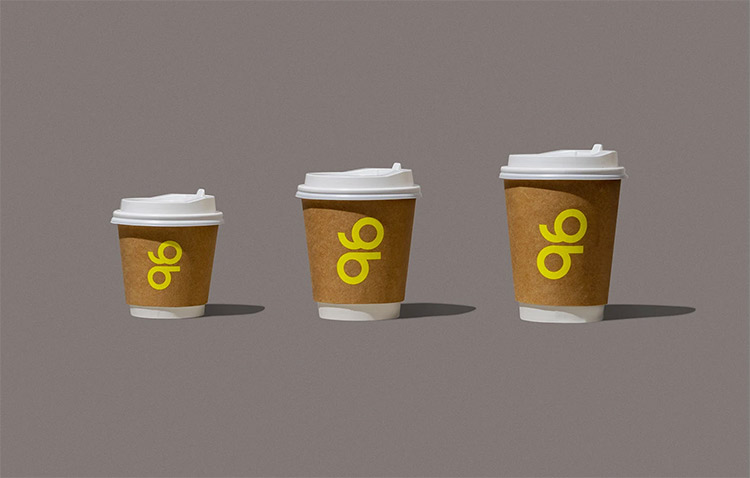
Beyond aesthetics, the strength of Glow Bite lies in its packaging system. The design adapts seamlessly across different products, maintaining consistency without becoming repetitive.
Each layout is carefully considered to interact with the structure of the packaging, creating a natural flow as the design wraps around the product. This approach elevates the project from simple visuals to a fully realized brand system.
Why simplicity wins in modern branding
What makes this project particularly effective is its restraint. Instead of overloading the design with elements, it focuses on clarity and intention. This results in a clean, confident identity that feels contemporary and scalable.
For designers and brands alike, Glow Bite is a strong reminder that in modern branding, less—but better—is often the key to standing out.
By NewDesignLab