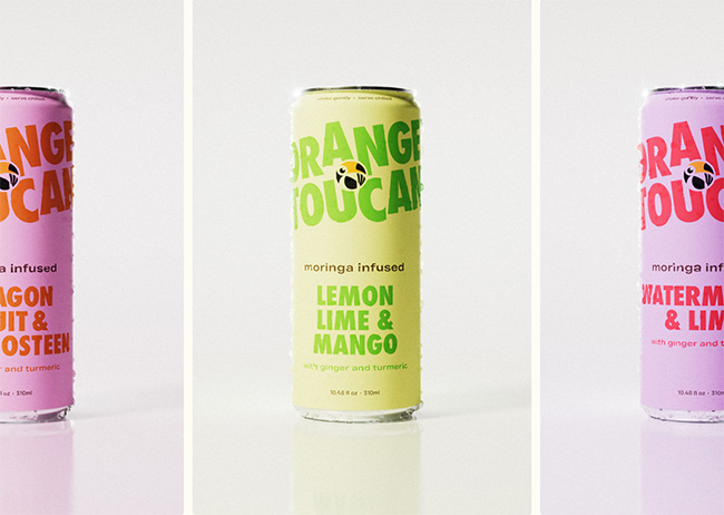
The well-known functional, plant-based beverage line, Orange Toucan, is reinventing its visual identity with a striking packaging redesign. This move, aimed at capturing the attention of health-oriented consumers, embraces vibrant colors and modern typography. The brand’s refresh coincides with its ambitious plans to expand reach and secure additional funding through an upcoming crowdfunding campaign.
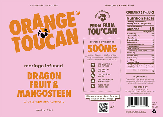
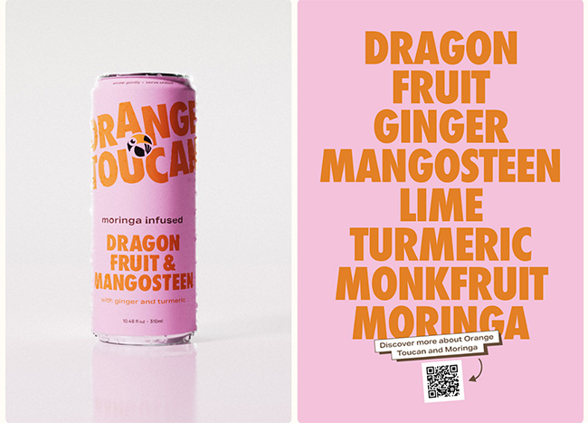
Orange Toucan’s core offerings are crafted with natural ingredients, with a spotlight on Moringa—a superfood renowned for its nutrient density. Each of their beverages delivers a potent 500mg of Moringa, complemented by the wholesome benefits of ginger and turmeric. This blend ensures a nutritious boost with every sip, all without any artificial additives or colors.
In collaboration with the Amsterdam-based ©Hello Comrade, and designers Spencer Woolcott and Gijs Lammers, Orange Toucan’s redesign focuses on enhancing shelf appeal. Saxon Campbell’s 3D rendering expertise further elevates the packaging’s aesthetic, providing a fresh, fruit-forward identity that reflects each drink’s unique flavor profile.
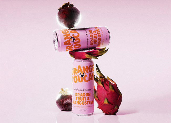
Packaging Design
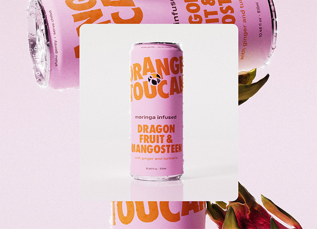
The Orange Toucan packaging is a striking example of contemporary design tailored for the functional beverage market. Their approach combines vibrant hues and bold typography to create a visually arresting package that commands attention on the shelf. The pink background serves as a dynamic canvas, playing off the citrusy orange of the logo to enhance brand recognition and foster a sense of freshness and vitality.

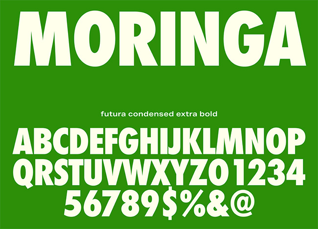
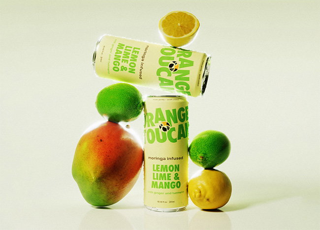
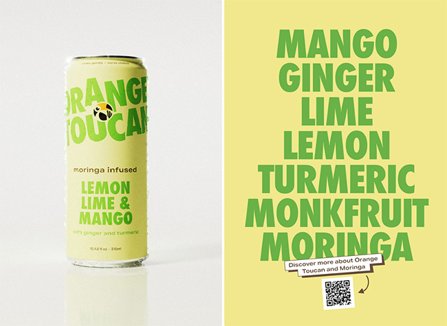
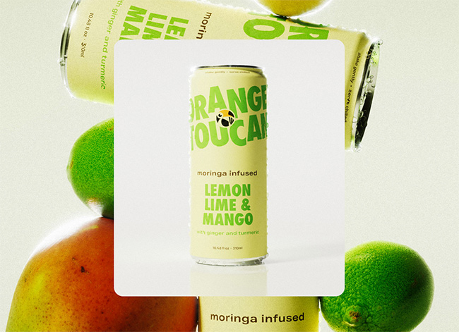
In crafting the typography, they opted for a robust, uppercase style that communicates strength and confidence, perfectly aligning with the health-centric ethos of the product. The flavor profile, “moringa infused DRAGON FRUIT & MANGOSTEEN,” is strategically emphasized through a dual-color text, highlighting the exotic and natural ingredients that set this beverage apart.
They integrated the additional ingredients—ginger and turmeric—using understated yet elegant lowercase lettering, drawing in the health-conscious consumer who values transparency and quality.
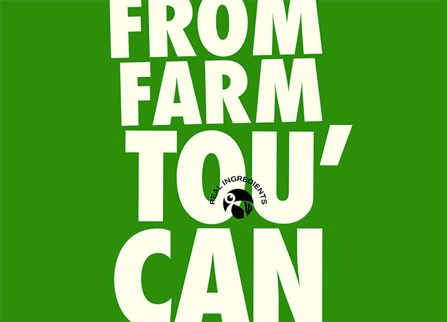
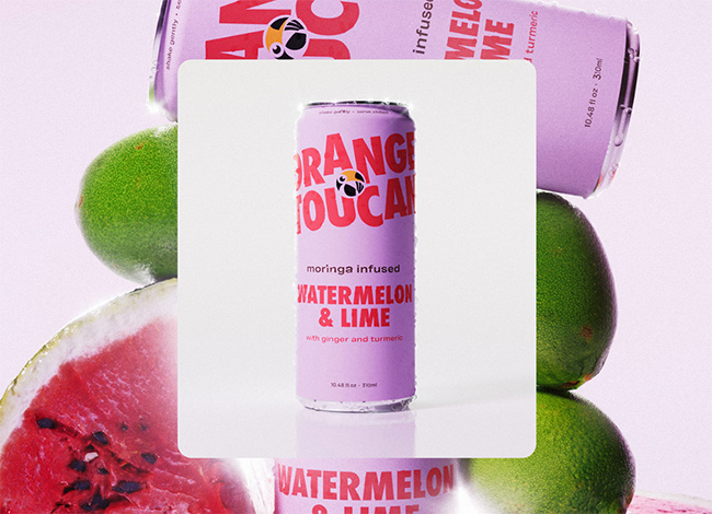
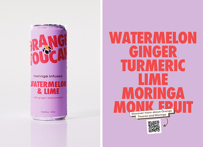
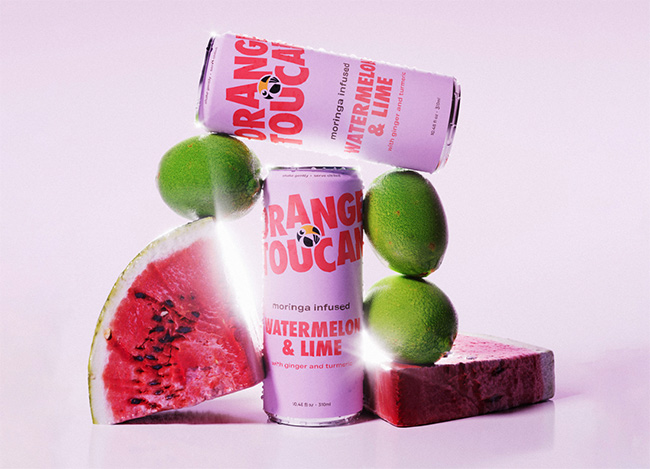
Overall, the design is minimalist yet impactful, a harmonious blend of energetic color and clean typography. It effectively conveys the brand’s commitment to natural, additive-free products while appealing to an audience seeking both style and substance in their wellness choices.

